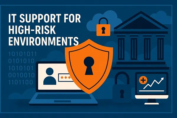
Infographics – Should You Use Them on Your Resume?

As a staffing agency, we see a lot of stuff at Tier2Tek. It’s almost as if every day we are faced with a new trend, pushing our already-ancient perspectives even further into the past. As an employment company, we are required to stay up-to-date with all of the new intricacies of hiring and applications, sure, but it doesn’t mean oncoming ideas can’t sideswipe us. We stay advanced with our ideals, but sometimes it takes a few blinks to catch up. A few moments of ‘Why exactly is this happening?’ And, in those moments, you feel old. Out of touch, even. Infographics on resumes and infographic resumes were one of those moments.

Now, without us sounding like curmudgeons, we’ll note that our first experience with infographics on an application was interesting. To say it doesn’t catch the eye of the audience is certainly a lie. It is, in all facets, visually interesting. In no way would we ever discredit or downplay the amount of effort that goes into creating an infographic resume. For those of us that stick to words over visuals (me), it seems like a herculean feat.

But, impressiveness aside, the real question remains. Are they actually worth the effort? Is a fancy infographic going to be the extra boost that pushes you into your dream job?

As national recruiters, we see all types of new resumes and applications. We also deal with sending these specific applications to client companies. Therefore, we know a thing or two about the effectiveness of infographics. So, let’s discuss before you jump into a full-effort graphic assault on your next application.

What Are Infographic Resumes?

Now, we aren’t going to try to dissect the history of infographics. Not only are we not digital art historians, but we’re not even graphic designers. We just hire them.

Regardless, if you were to pinpoint the ever-growing popularity of infographics, it would probably start with the graphic designer, Nicholas Felton. Felton’s resume includes designing for Facebook, Apple, and Daytum. His biggest achievement, and his most well-known contribution to the art world, is his creation of complex infographics.

According to the linked Wiki article:

“[Felton] work focuses on “translating quotidian data into meaningful objects and experiences”.[5] His most famous art project is the Feltron Project (personal annual reports starting in 2005 until 2014), where he registers the minutiae of his life, including data regarding the places he visited, the music he listened to, and his everyday activities in general (gathered from his own memory, calendar, photos, and Last.fm data) and transforms it into a series of artistic charts. His purpose is not only analytical but also aesthetic, playing between the realms of self-quantification, design, and art.

Basically, Felton started creating interesting graphics detailing his daily life. They caught on like wildfire, and have pushed the usage of these data-based images into seemingly every sphere of modern life (resumes included).

And speaking of art without visual representation would be a disservice to his craft. Therefore, we recommend checking out some of his work on Feltron (after the article, of course).

But What About Resumes?

We’re getting seemingly sidetracked. Apologies.

Basically, infographics have become all the rage in the last decade. They’re now easier than ever to create (though creating great ones still requires extreme talent) and they will always be favored by those that think visual popping is the key to anything (applications included).

With this rage came infographic resumes. These resumes include all of the information of a normal CV, but now cram or spread it about the document in an aesthetically diverse format. People may believe that the old pen-and-paper resume is boring, reaching for a more art-based option.

Note the color, modern design, use of circles, and other new-age-resume tactics.

And, though these infographics haven’t become the new norm, you will see a plethora of information and discourse around them online. Just a quick Google search will net you hundreds of articles explaining how to make them properly or why you should use them. But, none talk about the true nature of the topic. The true question behind each color-splattered document.

Is It Too Much?

Let’s huddle down here. There’s clearly a contradiction we must discuss.

Firstly, let’s refer to one of our amazing articles on Tier2Tek.com, Build the Best Resume – 31 Tips You Must Follow (I wrote it. It’s really good).

We are going to highlight the first 3 tips on that list. Ready?


Resume Color (But Not Colors)

Your resume should have a bit of color. This may include a colored box for your contact information (we’ll get to that later) or color in your header. A strip of color down the side is also a possibility.

Do not, and I cannot repeat this enough, do not use more than one color. Two at the most, if it’s extremely applicable. Keep your letters black. Keep your page white. It’s that simple. Once you start combining colors, things get overlooked. Yes, it should look eye-catching, but you still want the reader to. Well. Read.

This is not a Picasso painting.

Use a Template

If you are not the most artistic of souls, that’s okay! Every word processor has a list of templates for resumes. Start there. If you cannot find something you like, try a different program such as Google Docs.

Just remember the overall rule: Your resume should not be too outrageous and full of colors and shapes. It should pop, but not keep the reader’s eye.

No Pictures. No graphics.

This goes without saying. Do not include any pictures on your resume. You do not need a headshot. Though you are a superstar, this is not an audition for a summer blockbuster.

Furthermore, stay away from graphics, illustrations, or abnormal fonts. Keep everything professional and aesthetically simple. Though you want to catch the attention of the job, you want to keep their interest with your actual resume content.

Skip it. Ditch it. Keep it clean.


What’s Your Point?

All of those aforementioned tips quietly go against the idea of infographics. Therefore, it’s easy to assume we would be against the idea of infographics on any application. Right?

Call us old-school, but the idea of a resume should be both sweet and simple. It’s your elevator pitch, the concept of putting the important details directly in front of the correct eyes, beckoning them to want to know more. It’s not an autobiography. If the hiring manager wants to know more details after the resume, one, it succeeded in its purpose, and two, they can reach out to you.

Now, that creates another contradiction. In theory, the infographic resume is not used to obscure information but to provide quick info in an appealing and easy-to-understand format. Meaning, infographics would fit in line with the needs of the last paragraph, but not the tips of the aforementioned article.

So, how can you note that a resume must catch attention
and pop but also say it should be bland in design?

Well, we’re not the only ones that prefer the old way. In fact, the majority of companies will quickly pass over infographic resumes (we’ll note why later). Though we can’t 100% pinpoint why, it does come across as tacky. It’s just too much like someone crying for attention instead of winning attention organically.

Though they often don’t act to obscure the information, they inadvertently make it less relevant and shaded. As if the applicant is trying to hide their lack of experience or skills through visual distractions.

The classic resume is tried and true. Getting aesthetically fancy is a turnoff for most employers. It comes across as a bit pompous and that you have too much time on your hands, something a true professional should never have (or simply doesn’t have).

Note the Guides

Interestingly enough: look at every single guide for making infographic resumes online. There are tons.

Every single one of them has a note stating that you should not make it too complicated or too colorful.

For example, let’s break down the top-2 guides for resume infographics.

Indeed Career Guide says: While using infographics in your resume can make it stand out, keeping the content simple is important. Focus on showing why you’re a good fit for the company to improve your likelihood of securing an interview and being hired. You can review infographic resume examples to draw inspiration from other professionals in your industry.

MakeUseOf says: When it comes to colors in your resume, subtlety is the way to go. Neon greens and pinks may be your favorite colors, but they don’t have a place in your resume. You can only personalize your infographic resume within reason. So stick with greys, blues, and greens. Also, if you’re adding more than one color, carefully choose colors that complement each other.

So, if every guide has to tell you not to make it too complicated, then isn’t that just stating you should use a normal resume template? If colorful and complicated is the point of the infographic, but everyone says not to follow the main point, then why use it at all?

It’s as if the normal one-color resume template is both useful and classic,
making the infographic version a scary tiptoe on the line of too much.

It Depends on Your Industry

Though we don’t entirely agree with the usage of complex resumes, there are some uses for them. We would be lying if we said some industries and hiring managers do like them. They may be rarer than your normal resume-enjoyer, but they do exist. Therefore, if you decide that’s what you want to do, that’s entirely okay.

We aren’t claiming that it will destroy any chances of landing a job, but there are some things to take note of.

Firstly, which industry you work for does make a difference in the relevancy of the resume. For example, if you work in graphic design, having an expert-level info resume will be a great way to demonstrate your abilities from the jump. It’s possible that the graphic design industry has the most use for the idea, and probably already sees millions of them flying around daily.

Secondly, if you are in the digital advertising industry, an info resume could also work. Not only does it represent your ability to create marketing tools, but it works to market yourself. It’s a win-win in that industry and self-selling (the key to any resume, especially in digital marketing).

On the other hand, a full-out infographic for a job in the legal industry seems both out-of-place and unnecessary. Therefore, you need to look at the nature of your sector and what matters to those hiring managers specifically before making your decision.

It Depends on the Intricacy

There is a point to be made about originality if kept in the realm of subtlety. For example, we see hundreds of resumes a day. Therefore, we’ve seen each resume template Microsoft Word has to offer countless times. If you were to create a unique template, then that’s both respectable and noticeable. But it must remain as subtle and simple as the ones on Microsoft.

For example, look at the basic resume templates on Word.

If you were to create a template akin to one of these, then that’s understandable. As long as you follow the rules of simplicity. Which, at the end of the day, isn’t really an infographic resume, but a new template created by you. So, I guess we’re defeating the purpose.

The point still stands: infographics are too intricate. If you create something simplistic and unique, it will end up being a normal resume template like the ones above. Which, by definition, isn’t really an infographic after all.

It Depends on the Communication Medium

We can argue about the usefulness or attractiveness of info resumes all we want, but there’s factual proof that they hold you back from winning certain jobs, especially those at larger companies.

Applicant Tracking Systems (ATS) are used to keep track of all the resumes a company collects. The software looks over all of the applications and provides the hiring managers with the most related and applicable resumes of the bunch. It’s a useful way to lighten the human resource department’s load. If you are getting applications all day, it can be impossible to keep track of them without help.

Over 98.8% of Fortune 500 companies use ATS while 66% of large companies and 35% of small organizations rely on them (as of 2022). Therefore, if you are applying to a large company, it will likely go through a scanner.

These scanners go over keywords in your resume and application, connecting them to the keywords searched by the company. If, for example, the company is hiring a graphic designer, they may scan all resumes for skills in Photoshop. If your resume doesn’t include the pinpointed words, it won’t show up. You’ll be overlooked immediately.

Here’s the tragedy: a lot of the scanners rely on certain document types. They simply might not be able to pick up any of the words on your infographic. Therefore, your effort goes to waste. The manager didn’t toss your resume, they didn’t even see it.

Henceforth, the situation truly matters. If you are aiming for a huge job, avoid the infographic entirely. Stick to your classic resumes. If you are emailing the hirer directly, that’s a different story. In that case, feel free to use them if you want.

Applying on a company site? No way. Avoid complicated graphics like the plague.

Is It Really Worth It?

Now is the time for the big question: should you even worry about making an infographic resume?

Our honest opinion? No, not really. It really may be more effort than it’s worth. Though there are yet to be any revealing statistics about whether employers like them, our general consensus is that they do not. They can be seen as too complicated, too distracting, and too showy, making them a major turnoff for busy hiring managers. Ultimately, you want to get to the point and let the experience speak for itself, not try to overcompensate with loud design.

Will it win you some jobs? Maybe. There may be some managers won over, but it doesn’t seem to be the majority. With the concept of it not being picked up by ATS scanners, it makes the idea seem bad all around.

As of 2023, we would not recommend focusing your time on infographics, regardless of your industry. This is always subject to change, though. The employment world moves fast.

Portfolio Covers Work

Now, we will mention 2 places in which infographics do bolster your work, if you are so inclined.

Firstly, you could use an infographic for the introduction slide or page of your portfolio. With this, you give the viewer a quick reminder of who you are and what your main selling points are. Then, they are refreshed when going into your portfolio. Furthermore, if the infographic is part of your professional, it works as a win-win.

At the end of the day, it’s a quick advertisement that can work as a bonus piece of your graphic portfolio. In this usage, the graphic makes complete sense.

It Works for Your Website

Like the portfolio, the infographic can be a wonderful addition to your professional website. Much like Feltron before, the graphic can act as a clickable and digestible way to get all of your resume information across on your website. If done correctly, it can be an active way to draw in employee seekers that have come to your site.

Much like the portfolio, the interesting infographics on your site can bolster your overall resume, especially if you are a web designer.

See? Infographics aren’t completely useless!
They can be an impressive way to bolster your website and portfolio and display information about your skills.
We wouldn’t recommend using them for your daily application process, though, for they are
often too muddled and easily overlooked by hiring managers and ATS software alike.